


They all want to give you just enough control to make you think you chose what their algorithm recommended for you.
Anyone who thinks that these three have the worst UI possible has never had to deal with a really bad UI. Try Sharepoint on for size. Or Azure. Or Jira. And there’s likely still way worse stuff than those.
Haha, you think those are bad? Try any professional tools, like CAD’s, DAW’s, or 3d modelling software.
Or, even worse, any internal corporate software, the bigger and the older the company is, the better… at being the worst, that is.
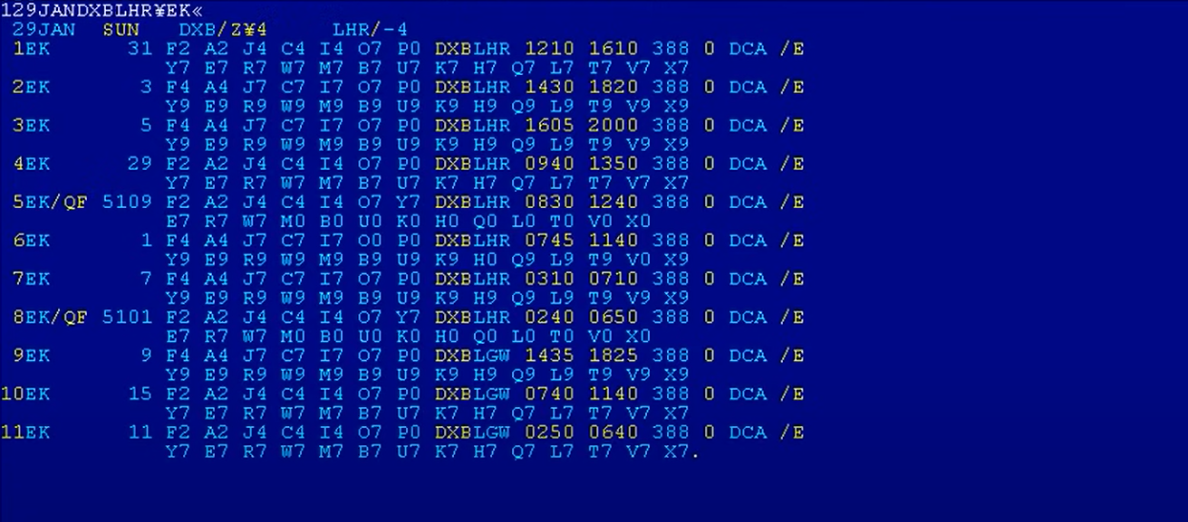
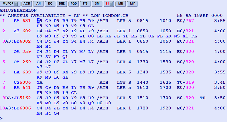
Or. actually, just go to an any airline’s office to buy a ticket and witness the atrocity they have on their monitors. No, those are not blue screens of death. That bunch of gibberish is the actual UI. And the only way to interact with it is by typing in commands that read like something that Lovecraftian creatures would sound like.
Those systems are so much faster and more reliable than the bubbly shit we have now. All that crap on the screen is what we call “information density.” It’s designed for people who work with it several hours a day and understand it, not for some random to be able to learn in 15 minutes. It has a longer learning curve, but is way more efficient in the end.


The UI of Youtube is actually not bad. What is bad is how the search function has gone to shit, constant promotion of youtube Shorts taking up half the screen, and the algorithm getting steadily worse at recommending videos.
The interface itself is pretty easy to navigate.
I do feel like the mobile app has been getting progressively buggier over the last year. Maybe it’s just me but the mini-player has been glitching out for months and other weird stuff has been getting more prevalent like yesterday I had the YouTube play button icon stretched and distorted as an overly across the whole app until I restarted it and creating a queue didn’t work until I started a new video manually.

add whatsapp web to the list


