


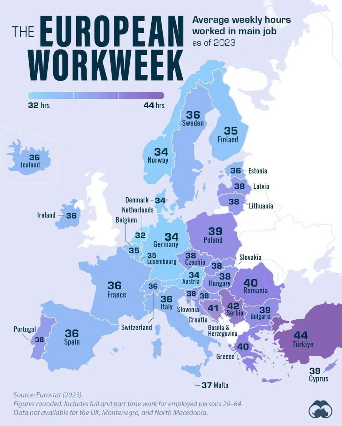
With some exceptions, you can see the blocks of predominantly Romance, Germanic and Balto-Slavic speaking countries grouping together in the same color.
I think this chart shows how relevant these basically bronze or iron age cultural categories remain in certain spheres of our lives - attitudes towards work, for example.
There are so many things influencing this that, I doubt bronze age cultural groupings are the most important, if the have any influence at all.
Yeah, for sure a lot of factors go into this. And the pattern definitely doesn’t hold everywhere. But the similarity looks pretty noticeable to me.
Plenty of other things play a role. For example, employment of parents It’s very common here in the Netherlands for both parents to work part time. It’s very common in other countries to have one parent working full-time and the other not at all.
The end result is basically the same, but they show up very differently in this chart.

That big white void where the UK should be is an insult to cartography.

Dissemination of European statistics after Brexit
This means that until agreement on statistical cooperation is established, Eurostat is no longer disseminating new data for the UK, neither through its database nor in other dissemination products.
Brexit was “good” for European democracy, because it proofed federality, but those experiments are costly to both parties (EU27 + UK) and dangerous to European peace in the long term. Brexit also might set precedents for unfair double standards in diplomacy and cooperation, IMO.
But they don’t have the data? Sure maybe another colour could’ve been used instead, but there’s no real reason why white would be wrong.
Its 42 hours in switzerland. Map has an error.
34 hours in Germany are probably just because the statistics does not only evaluate full time employment.
What is full time anyway? Nobody in our company works more than 35 hours. I work 32. Does that mean I work part time?
Generally full time is still understood as 40 hours per week or close to it.
Honestly, I don’t see much worth combining full and part time without showing the proportions and how many hours constitutes a full time job.
Yeah, it’s a pretty bad chart because all it actually does is show indirectly the proportion of full time and part time workers. All the chart tells me is that Netherlands has a lot of part time work opportunities and that the full time work week in Turkey isn’t 40 hours.
