
4 points
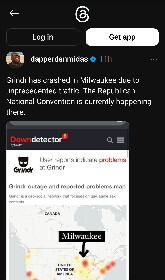
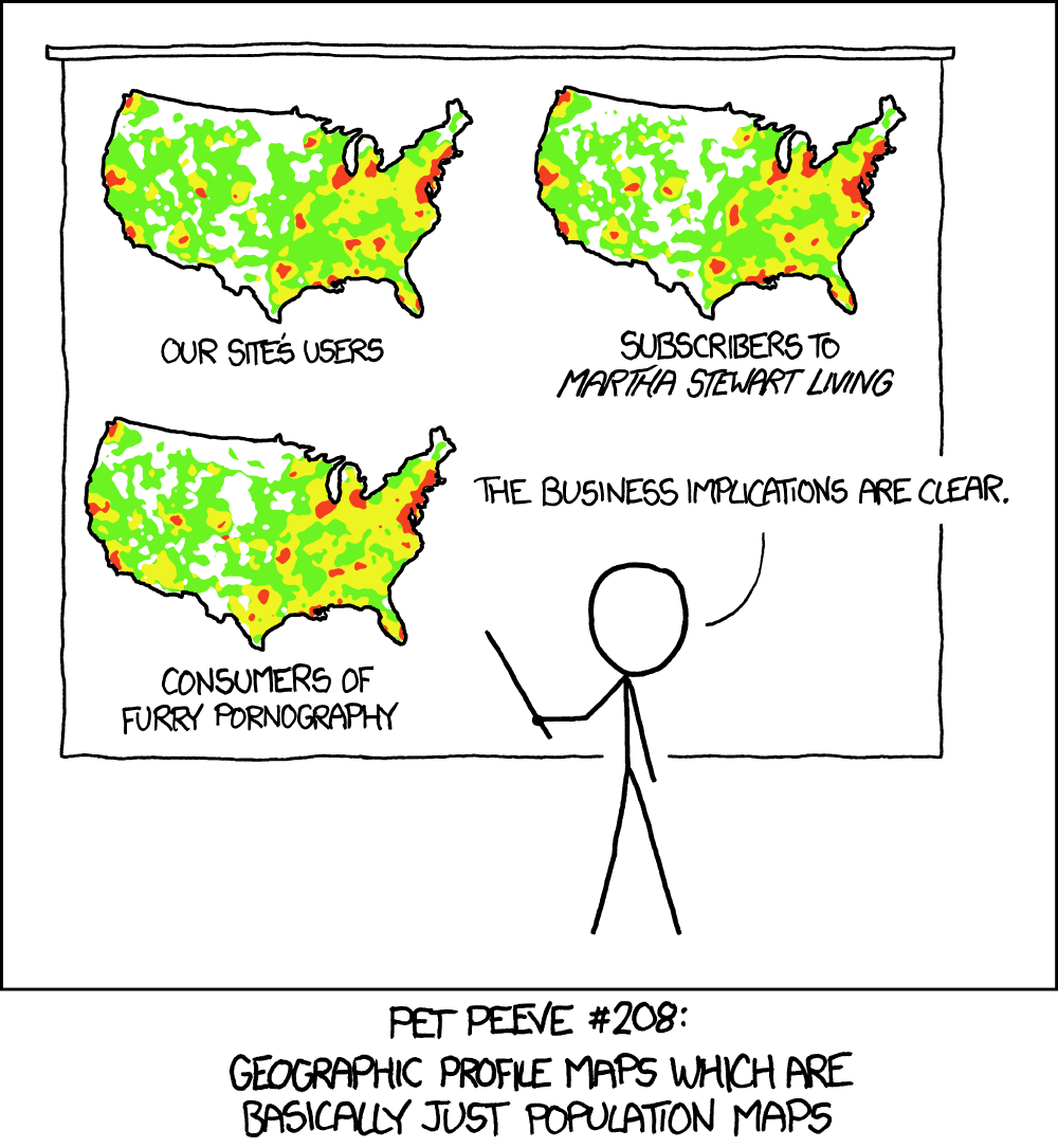
No, because the map is showing how many reports they got. So it’s red where they got a lot of reports, and that correlates very tightly with where there are a lot of people, making the visualization kind of worthless.
0 points
No, because the map is showing how many reports they got. So it’s red where they got a lot of reports, and that correlates very tightly with where there are a lot of people, making the visualization kind of worthless.
Welcome to politcal memes!
These are our rules:
Jokes are okay, but don’t intentionally harass or disturb any member of our community. Sexism, racism and bigotry are not allowed. Good faith argumentation only. No posts discouraging people to vote or shaming people for voting.
Don’t post any intentional misinformation. When asked by mods, provide sources for any claims you make.
Random pictures do not qualify as memes. Relevance to politics is required.
Follow instance rules, ask for your bot to be allowed on this community.
11K
Monthly active users
1.5K
Posts
39K
Comments


