You are viewing a single thread.
View all comments View context
9 points

“Everywhere” would imply the entire map is red, thanks.

permalink
report
parent
reply
6 points

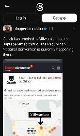
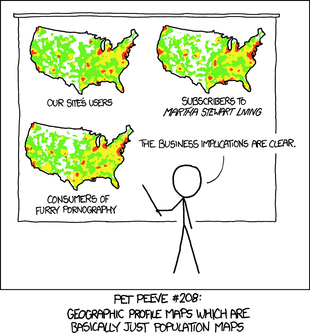
No, a population heat map means it’s darker over the cities. There’s more reports in Chicago than say, middle of nowhere Montana because there are more people there to report. This map is reporting the locations people are when they report it is down. And the circles get bigger and darker the more reports from that area. So if it was down everywhere, you would see the biggest circles over the biggest cities, and smaller circles in smaller cities, just like in this map. You see NYC, Boston, Chicago, San Fran have the biggest ones, and then smaller cities like Minneapolis have smaller ones.

permalink
report
parent
reply
4 points

No, because the map is showing how many reports they got. So it’s red where they got a lot of reports, and that correlates very tightly with where there are a lot of people, making the visualization kind of worthless.

https://imgs.xkcd.com/comics/heatmap_2x.png

permalink
report
parent
reply
0 points

Shut up and give me my Martha Stewart furry porn! 😁

permalink
report
parent
reply

Political Memes

!politicalmemes@lemmy.world

Create post

Welcome to politcal memes!

These are our rules:

Be civil

Jokes are okay, but don’t intentionally harass or disturb any member of our community. Sexism, racism and bigotry are not allowed. Good faith argumentation only. No posts discouraging people to vote or shaming people for voting.

No misinformation

Don’t post any intentional misinformation. When asked by mods, provide sources for any claims you make.

Posts should be memes

Random pictures do not qualify as memes. Relevance to politics is required.

No bots, spam or self-promotion

Follow instance rules, ask for your bot to be allowed on this community.

Community stats

  • 11K

    Monthly active users

  • 1.5K

    Posts

  • 39K

    Comments