You are viewing a single thread.
View all comments View context
-7 points

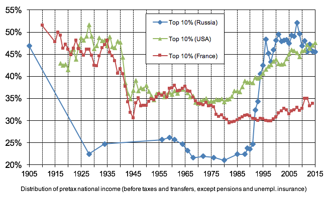
Left column isn’t labelled, no source is provided, Russian points on the graph are sparse when compared to the USA and France lines, there’s no heading explaining what the graph says. Please do better.

permalink
report
parent
reply
10 points
10 points

For images that don’t list the source in themselves like these I like to put the source in the alt text like this

![https://cepr.org/voxeu/columns/soviets-oligarchs-inequality-and-property-russia-1905-2016](https://lemmy.ml/pictrs/image/65a34c1d-e49d-47b1-bf83-07c344b109d5.png)

permalink
report
parent
reply
7 points

Oh, nice! Thanks!

permalink
report
parent
reply
4 points

I’m usually quite particular about labelling axes, but this graph has both axes partially labled, and while the dates are easily inferred, the meaning of the left axis is in the footer, as is the general explanation.

permalink
report
parent
reply

Memes

!memes@lemmy.ml

Create post

Rules:

  1. Be civil and nice.
  2. Try not to excessively repost, as a rule of thumb, wait at least 2 months to do it if you have to.

Community stats

  • 12K

    Monthly active users

  • 5.7K

    Posts

  • 36K

    Comments