


12 points
-2 points
*
13 points
*
-7 points
*
10 points
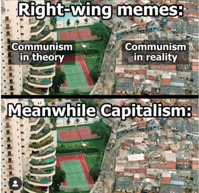
I’m assuming you’ll actually answer now that the full source is linked, correct? Or are you just incapable of facing reality?
10 points
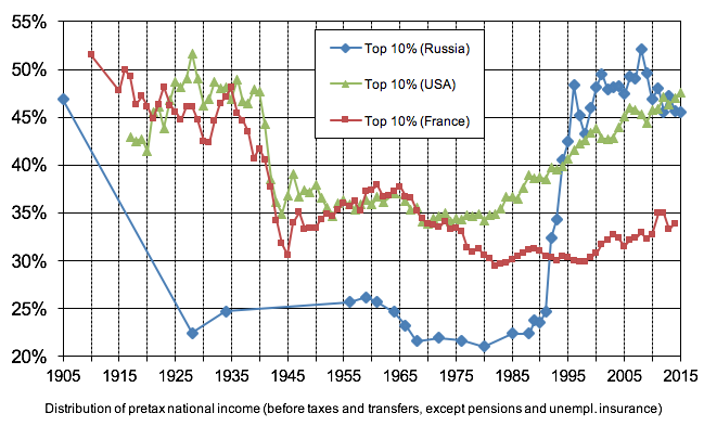
For images that don’t list the source in themselves like these I like to put the source in the alt text like this

4 points


