

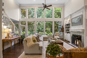
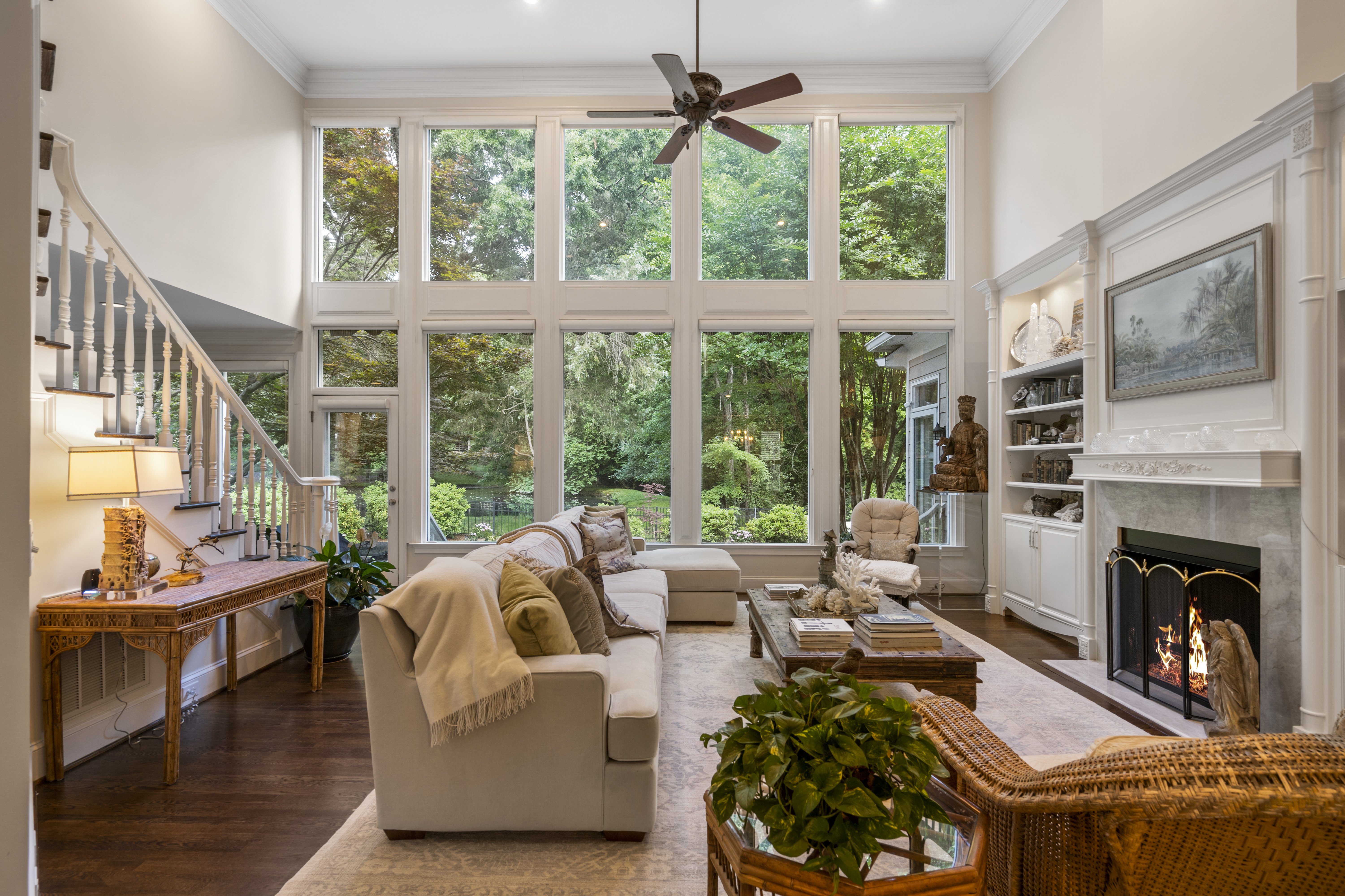
This one here is one of my all-time favorite interior photos. I absolutely love the gigantic windows and hate to think how expensive something like this would be.
As for the photo, I like everything about it. The staging was fantastic and the colors and design of the space works so well. I feel like these interior type photos are hard to critique because I really didn’t do much work to get this photo. Just tripod positioning and the thought process to decide this was a good angle to capture.
I do think i should have raised the tripod. There may have been something preventing me from doing so. I know there was a catwalk style walkway overhead and maybe that ceiling line was butting into the frame when the tripod was higher…who knows! This photo was taken at least a year ago, but I think it’s a great one to share!