

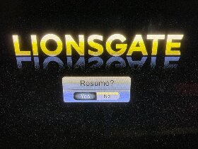
It looks like the ui designer didn’t know how scaling works for images
I think we need to know what the UI looks like before a selection has been made, or what it looks like when the curser is over each option. The ‘interface’ part is lost by a single screen shot.
When you’re not using a pointer interface (mouse or, awkwardly, wii-mote) it’s extremely rare for the UI to ever be in a neutral (nothing selected) state. Since you’d always be navigating relatively (go right, down, up, or left) instead of absolutely (go to pixel 753x1034) there always must be some point of reference for that movement.
Once in a blue moon you’ll see a menu where your initial selected position is something like “before the first item” so when you press right in a horizontal selector you actually move from nothing selected to the first thing selected and it’s almost always a terrible UX. If you set up such an interface you’re accepting that every action will require an extra useless click and that users entering the state freshly (i.e. you reach this screen then walk away and your partner is the next person to see it) will be confused about where in the action they are. You’re also accepting responsibility for what will happen if the user confirms without ever actually making a selection which will usually require some (again, utterly unnecessary) dialog box asking the user to try again but this time actually select an action.
Relative navigation having a neutral/unselected state is almost always a mistake.
Press left. If nothing changes, then Yes is selected.
You’d be surprised how many shitty UIs x-wrap navigation when there are only two options.
Not a great UI but honestly the yes looks pressed in the 3d meaning of the word.
So it’s not terrible
I think that might be because modern UI tends to move away from 3d and insted highlights the selected button (making it lighter in color)
Yeah I think that’s the problem here. Older uis leant into the faux 3d thing whereas modern designs are mostly flat/minimal
You should post this in the group assholedesign. This is genuinely so bad it’s infuriating.
Really? Literally everyone in this thread figured it correctly as yes. So it’s really not that bad.
Alright I’ll reiterate my statement to exclude people who are literally blind.


