

Now the squares that have no video and could have been easily put away elsewhere are now big as ever and colorful!
Fuck full screen of presentations! You need to see people’s names on big ass squares covering the entire screen! That’s where the money is! There is always a banana stand! (Don’t know the context)

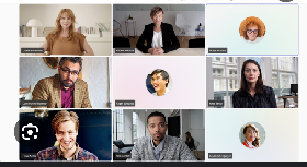
This actually is an improvement. Not everyone wants to be on camera and for those folks, getting pushed off to the sidebar often means they’re overlooked.
This at least means they’re given the same importance as anyone else.
No idea what the rant about presentations is about, when anyone presents it becomes the main content and everyone - camera or not - gets pushed to the sidebar. You can also pop out presentation content to give it it’s own dedicated window.
I hate teams as a communication platform, but the presentation and meeting views are actually pretty well done compared to the competition.

this! i hate on zoom how it only focuses on people on camera.
in fact the only thing i hate is how horrible it runs in the browser in firefox :/

Shameless plug for a FOSS alternative:
I can’t even get my InfoSec team to let us use all the features we already pay for in our M365 E5 license because they can’t figure out how to secure and govern it. Unfortunately nowadays bringing up great ideas that are open source to replace mediocre big tech products mostly gets laughed out of the room 😢
This is awesome. But I’m a little suspicious. How is it completely free? Seems like video conferencing would use a lot of resources

Honestly, I prefer this Zoom-style view over the way teams segmented put camera-off people in that tray. Those people often got skipped over.
Much better UX, not hiding people that have turned off their camera.
Chill out, man. And also don’t be a dumbass.
“There is always money in the banana stand” is from the TV series Arrested Development. Personally I prefer to turn incoming video off during meetings, as I find it distracting.


