You are viewing a single thread.
View all comments
0 points

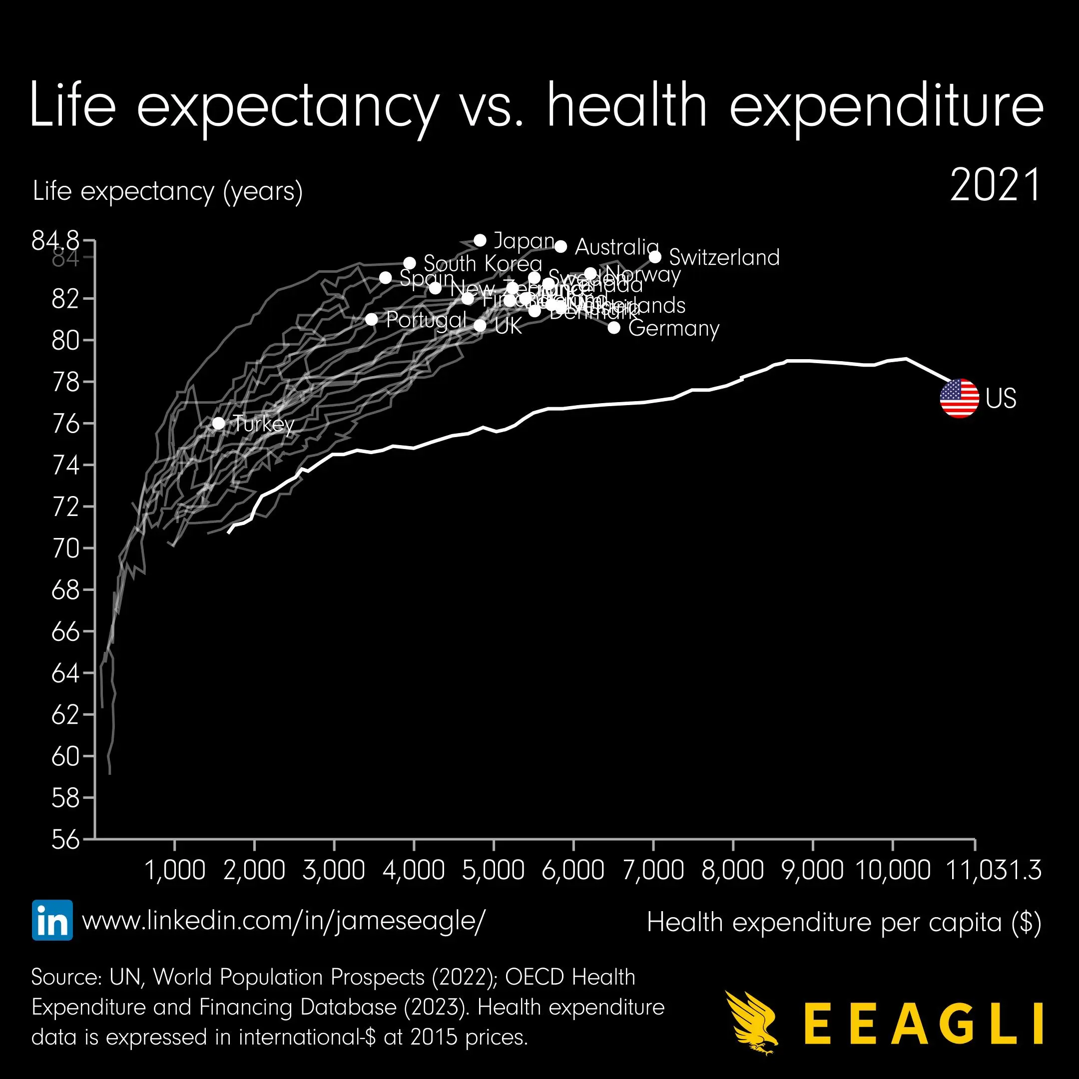
…how did the line come about? How did they determine what the life expectancy would have been with less expenditure per capita?

permalink
report
reply
0 points

I think the line might be historical data?

permalink
report
parent
reply
0 points

But… from when? Surely expenditure hasn’t gone up linearly with time

permalink
report
parent
reply
0 points

My guess is that this was a gif at some point and the line is historical data

permalink
report
parent
reply
0 points

Definitely, you can see some lines in the top left zigzagging back left, which would not be possible if each was a function of the x-axis. In fact, both axes are a function of the hidden z-axis, which is time and comes in discrete yearly steps, the latest of which (2021) is highlighted.

permalink
report
parent
reply
0 points

At least one of those lines goes back on itself at some point, so my assumption is that it’s tracking where each country has been over time.

permalink
report
parent
reply
0 points
*

Ooh good catch. That makes sense. Not sure I would call this beautiful, especially without any way to tell how much time has passed, but fair enough

permalink
report
parent
reply
0 points

There is a minimum amount which is likely the least some people spent on their health. So there is no interpolation I can see.

permalink
report
parent
reply
0 points

That doesn’t make sense unless this was personal expenditure, which it doesn’t seem to be

permalink
report
parent
reply

Data Is Beautiful

!dataisbeautiful@lemmy.ml

Create post

A place to share and discuss data visualizations. #dataviz


(under new moderation as of 2024-01, please let me know if there are any changes you want to see!)

Community stats

  • 520

    Monthly active users

  • 58

    Posts

  • 420

    Comments

Community moderators