


You are viewing a single thread.
View all comments 
2 points
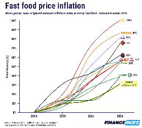
That chart is evil. First two ticks represent 5 years. Ticks 2-3 represent 2 years. The last two ticks represent 2 1/2-3 years!
Also, what’s so magical about 2014 that it deserves to be the baseline? I’d love to see this extended back to, oh, 2006 or so. Sometime before the Great Recession.
Finally, what about shrinkflation? I used to order from Panera on a regular basis, but during the pandemic, it seemed like their sandwiches shrank a little bit more between every order. At this point, I don’t think it’s even worth ordering from them.