You are viewing a single thread.
View all comments
-1 points
*

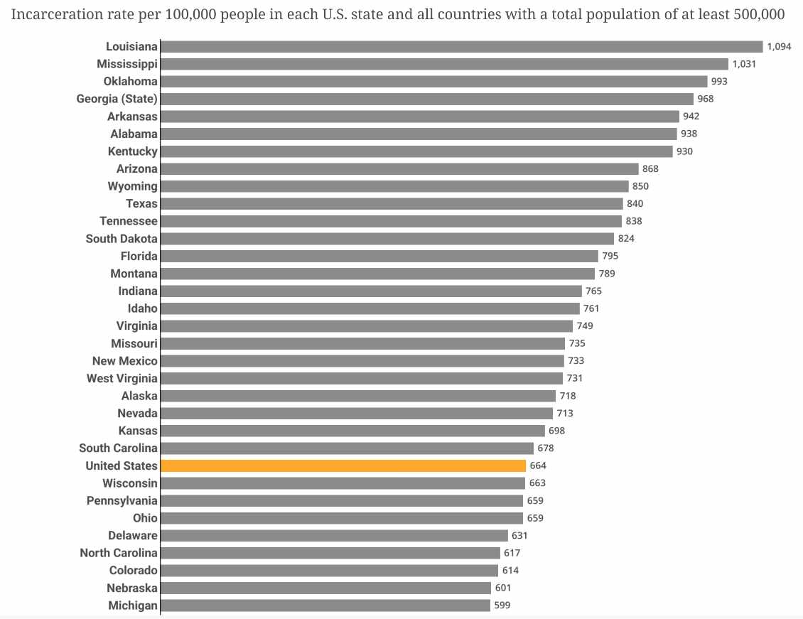
I don’t get this graph. So all of US has a smaller incarceration rate than just Louisiana? What?

permalink
report
reply
10 points

Yes, look up what per capita means.

permalink
report
parent
reply
8 points

Thats how averages work, unlike eg maximums.

But Im sure reversing that chart would correlate with math test scores.

permalink
report
parent
reply
8 points
*

i have 4 boxes labeled A to D, and 10 rocks.

i put 1 rock in A, 2 in B, 3 in C and 4 in D.

A[⚪] B[⚪⚪] C[⚪⚪⚪] D[⚪⚪⚪⚪]

i then paint 1 rock in B, 2 rocks in C and 1 rock in D.

A[⚪] B[⚪🔴] C[⚪🔴🔴] D[⚪⚪⚪🔴]

then i put the boxes in a bigger box called the united boxes.

here’s the rate of painted rocks:

  1. C 66% (2/3)
  2. B 50% (1/2)
  3. United boxes 40% (4/10)
  4. D 25% (1/4)
  5. A 0% (0/1)
permalink
report
parent
reply
6 points
*

The US average falls in the middle of the list of states, yes. This is a chart of per capita rates.

permalink
report
parent
reply
2 points

The entire US would have the average of all the states’ incarceration rates.

permalink
report
parent
reply

Data Is Beautiful

!dataisbeautiful@lemmy.ml

Create post

A place to share and discuss data visualizations. #dataviz


(under new moderation as of 2024-01, please let me know if there are any changes you want to see!)

Community stats

  • 520

    Monthly active users

  • 58

    Posts

  • 420

    Comments

Community moderators