You are viewing a single thread.
View all comments
3 points

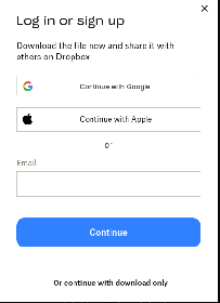
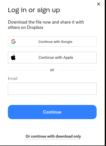
Or continue with download only

I mean, the bypass isn’t exactly hidden.

permalink
report
reply
4 points

No, come on. This is a dark pattern. It’s easy for someone technically-inclined, but most users see only the big obvious buttons and skip right over what looks like it could just be an irrelevant footnote at the bottom. My parents would absolutely end up creating accounts and be frustrated about it, but I’m also willing to bet most of my friends who aren’t in tech would do the same.

permalink
report
parent
reply
0 points

Maybe you should highlight it with a red circle, because I still don’t see it.

permalink
report
parent
reply
2 points

permalink
report
parent
reply
2 points

needs few circles around the X in the corner too.

bonus points for subtly hidden dick and balls, though

permalink
report
parent
reply
2 points

Oh, Oooh. NOW I SEE IT!

permalink
report
parent
reply
1 point

The problem is that they needed to have that big blue button be the download, and the “log in or sign up” should be that small, black text below it.

Better for the UX, and less of a dark pattern.

permalink
report
parent
reply
1 point

Get new eyes

permalink
report
parent
reply
2 points

Your free trial of Eyesight Pro™ includes full resolution and color for 7 days, after which you will pay $39.99/second. To cancel your free trial, click the transparent button below.

permalink
report
parent
reply

AssholeDesign

!assholedesign@lemmy.world

Create post

This is a community for designs specifically crafted to make the experience worse for the user. This can be due to greed, apathy, laziness or just downright scumbaggery.

Community stats

  • 239

    Monthly active users

  • 66

    Posts

  • 704

    Comments

Community moderators